|
Winold Reiss: A Pioneer of Modern
American Design
C. Ford Peatross
This article originally
appeared in the publication "Cincinnati Union Terminal
and the Artistry of Winold Reiss," edited by Dottie Lewis
(Cincinnati, Ohio: The Cincinnati Historical Society, 1993).
It provides a general overview of Winold Reiss's work in architectural,
interior, and furniture design, or "stylings" as
he referred to many of his commissions. The author is currently
preparing a monograph on the subject of Reiss's designs, based
on recent research, to provide a considerably enlarged presentation
of this aspect of Reiss's professional career and to place
it in the context of comparable work of the period.
Cincinnati is especially fortunate in having
not only one of Winold Reiss's most ambitious commissions,
but also one of the few that survives, for the nature of most
of his work in commercial architecture and interior design
was necessarily ephemeral. As a public building, Cincinnati's
Union Terminal is also exceptional in Reiss's work, although
the many restaurants, hotels, and shops which he designed
were at one time a part of the daily lives of thousands of
people. So prolific was Reiss, that by 1940, not counting
the Cincinnati station, in any one day over 30,000 Americans
lived, met, ate, drank, or were entertained in a Reiss designed
interior. Today Cincinnatians are alone in this privilege.
"Masterpieces" of architecture, landscape, and interior
design too often lie outside the paths of ordinary people.
Historians of vernacular and commercial architecture are now
directing increasing attention to the transitory structures
which constitute such an important part of our built environment,
and which play significant roles in the quality of our lives.
Although most of his works as an architect and interior designer
have disappeared, during four decades of practice Winold Reiss
set a course that in considerable measure contributed to and
enlivened American design. This is an introduction to that
largely unrecognized journey.
| |
 |
The Atlantic liner S. S. Imperator docked
in Hoboken, New Jersey, on October 29, 1913, bringing with
it from Hamburg three ambitious young men: Fritz Winold Reiss,
Oscar Wentz, and Alfons Baumgarten, each of whom played a
role in introducing modern design to the United States. One
was a young, brash, energetic, and talented artist fresh out
of Munich, then one of Europe's thriving art centers. Fritz
Winold Reiss (1886-1953) was well prepared to make his mark
in the New World. Trained by his father, the artist Fritz
Reiss, and at both the Royal Academy of Art, under the famous
painter and sculptor Franz von Stuck, and the Kunstgewerbeschule
(School of Applied Arts), under the equally notable poster
artist Julius Diez, he represented the coming together of
two great streams of artistic endeavor, the fine arts and
commercial art, which was a notable characteristic of his
time.
The professions of commercial and industrial design as we
know them today developed out of this stimulating convergence.
We are just beginning to study and to recognize the multiple
contributions which Reiss made to American architecture and
design. He helped to prepare the way for figures like Raymond
Loewy, Norman B. Geddes, Donald Deskey, and Walter Dorwin
Teague among others who established the United States as world
leader in commercial and industrial design during the 1930s.
In 1913, however, this country was on the distant edges of
the coming wave of change.
It is useful to observe that Reiss's education
in Munich's Kunstgewerbeschule reflected a turn-of-the-century
optimism that artistic talent and energy could and should
be productively channeled to the creation of the objects of
everyday life; that the lives and work of artists, artisans,
and workmen should be more connected; and that both commerce
and the human spirit would profit from such association. Riding
the crest of the Industrial Revolution, during the second
half of the nineteenth and the first half of the twentieth
centuries, study and training in the applied arts were the
object of considerable attention in Great Britain, Europe,
and, finally, in the United States, where industrial design
ultimately emerged as an independent profession. The career
of Winold Reiss was congruent with the birth of that profession
from the seeds of the Arts and Crafts and Applied Arts movements.
But it was more. Reiss brought to his work not just the principles
and skills afforded by his excellent training, but his own
artistic talent, allowing him to create works whose energy
and imagination continue to speak to us today, bringing both
pleasure and inspiration. The decorative vocabulary of Vienna's
Secession movement, the bold colors and forms of German Expressionism,
and the conventions and abstractions of African art, all evident
in Reiss's early work, were to be transformed into something
distinctly American.
From across the Hudson River, Reiss and his
companions were greeted by the daring new skyscrapers of the
world's greatest city. Considerably less daring was New York's
attitude towards modern art, notably demonstrated several
months earlier in its reaction to the famous Armory Show.
American discomfort extended to the realm of commercial design
as well, as they were soon to discover. Undaunted, perhaps
even challenged by this unreceptive atmosphere, Reiss and
one of his fellow passengers, Oscar Wentz, set out almost
immediately to introduce the bold colors and daring forms
of Modern Decorative Art to the land of the Puritans.
Wentz possessed something that was completely at home on these
shores: a keen entrepreneurial spirit which spurred him to
develop a wide range of projects. The direct result was to
provide Reiss with an immediate stimulus and patronage for
his work, including graphic and interior design, launching
his career and advancing Wentz's.
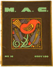
Oscar Wentz served as an avid propagandist and
promoter of modern commercial art. Within two years of his
arrival he founded the Society of Modern Art and began to
publish its official organ, the Modern Art Collector (M.A.C.)
(1915-18). Unprecedented in the quality and style of its printing,
as well as its subject matter, the M.A.C. served as
the main tool to promote the goals of the Society of Modern
Art and the work of its members. Wentz simultaneously attempted
to popularize the Art Poster Stamp in this country and enlisted
the support of executives in the infant motion picture industry
interested in improving American poster design.
He was described in 1929 as "a pioneer of modern art
in this country and the first president of the Society of
Modern Art, an early group of modem artists ."
Reiss played a key role in the production of
the early issues of the M.A.C., so much so that one
wonders when he had time to sleep or eat during its first
six months of publication. This work drew upon his experience
in creating the first issue of a periodical entitled Jungvolk
while still in Germany.
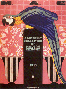
From September to December of 1915, he designed three of the
M.A.C.'s first four covers, much of what was inside, and
in large part established its graphic identity. Particularly
Reissian were the undulating vertical and horizontal lines
employed in borders and the slanting or falling letter "S,"
which later became hallmarks of his architectural and graphic
design projects. It is revealing to compare Reiss's first
M.A.C. cover to a poster designed in 1908 by Julius
Diez, his professor at Munich's Kunstgewerbeschule,
to promote an important applied arts exhibition.
Diez silhouettes a bold symbol of the genius of the arts applied
to the tools of industrial production against the outline
of Munich's Frauenkirche, while Reiss places a colorful parrot
and abstracted flower vases against a bright pink background
into which they partially blend. Both employ bold lettering
and simplified forms, large expanses of flat and contrasting
colors, and strong lines: the distinctive attributes of the
German Poster Style.
While the first M.A.C. cover was self-consciously
sophisticated and represented a tour-de-force of the lithographic
art, the tenth (ca. 1917) shows us another, quite different,
side of his artistic personality, the love of primitive natural
motifs and the ability to reduce and simplify them to essential
patterns of form, line, and color. The bird and flower motif
becomes a signature in much of Reiss's later work. The pages
of the M.A.C. also are useful in providing evidence
of the diversity and success of his beginnings. The start
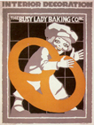
of a long career as an educator is signaled by a witty promotion
for the Winold Reiss School in which an artistic cherub armed
with a dripping brush tames a bucking tube of tempera. A more
restrained presentation of the importance of good lettering
in advertising was clearly designed to appeal to a different
audience of conservative businessmen. Reiss's first architectural
commission, the Busy Lady Bakery of 1915 (described in 1939
as the first modern store in New York) is covered at length.
Emphasis is given to the involvement of the artist in every
aspect of the store's design, from its interior and exterior
architecture to its advertising and bold blue and white packaging,
all illustrated in the M.A.C. Reiss worked out the
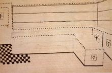
spare but elegant essentials of the interior design scheme
for the Busy Lady in a small design sketch whose strong lines,
squarish grids, and punctuation of broad flat surfaces with
simplified decorations recall the work of Josef Hoffmann and
the Vienna Secession and at the same time establish a recurring
theme in his own work.
The look of the M.A.C. was dramatic,
bold, colorful, self-consciously modern, and German. This
augured both good and ill for the fate of the publication,
for Germany, and Munich in particular, led the world in printing
technology and graphic design. The pages of the M.A.C.
are filled with the advertisements of printing firms and suppliers
throughout the United States with German origins: the Stockinger,
A. Bielenberg, and Zeese-Wilkinson Companies of New York;
Berger and Wirth of Brooklyn; Charles Hellmuth of New York
and Chicago; the Manternach Engraving Company of Hartford;
F. Weber & Co. of Philadelphia; the Meinzinger Studios
in Detroit; Frank B. Nuderscher of St. Louis; and the Barnhart
Brothers of Chicago, St. Louis, Washington, Dallas, Omaha,
Kansas City, Saint Paul, and Seattle, among others. Chicago's
Society of Poster Art styled itself as specializing in the
"Munich System" of designing and printing. None
of this commercial goodwill, however, was to prove equal to
the rising tide of anti-German feeling related to the First
World War (1914-1918), which the United States entered in
its last year. Modern German art had no place in a nation
whose army grew from 160,000 to 3,500,000 between 1916 and
1918 and was rationing meat and sugar in order to stop another
sort of Teutonic offensive.
The final issue of the M.A.C., published in 1918, put
forward its brand of Modern Art as European rather than heavily
German, and promoted the third Liberty Loan and the patriotic
involvement of all artists, but it was to prove too little,
too late.
| |
 |
|
|
Reiss worked out the spare but elegant
essentials of the interior design scheme for the Busy
Lady in a small design sketch with strong lines, squarish
grids, and punctuation of broad flat surfaces with simplified
decorations. |
To return to the last of our Atlantic voyagers,
Alfons L. Baumgarten was important primarily for providing
Reiss with an introduction to his brother, Otto, already well
on his way to becoming one of New York's leading restauranteurs.
Within a decade after his arrival in New York, Otto J. Baumgarten
came to preside over a small empire of the city's finest restaurants,
including the Voisin, the Crillon, the Esplanade, and the
Elysée.
Initially trained at his father's restaurant in Vienna, the
hearth of the modern movement in architecture, Baumgarten
was not blind to the commercial advantages of good design,
and saw the wisdom of using his eating establishments as a
proving ground for Reiss's work in interior decoration, for
which they provided a highly visible and suitable stage. The
first Restaurant Crillon of 1919-20, located at 15 East 48th
Street, caused a sensation referred to repeatedly over the
next two decades.
Called the "first modernistic interior in America,"
it featured flat, starkly delineated wall surfaces; prismatic
hues; and large, simplified decorations, presaging the "super-graphics"
of our own time.
All are evident in one of Reiss's small design sketches, where
the bird-and-flower theme of the decorative wall panels recall
the second cover of the M.A.C., and the avant-garde
furnishings are right out of Vienna. Another Baumgarten enterprise,
the manufacture of chocolates, led to the creation of establishments
such as the Baumgarten Café Viennois and Baumgarten
Viennese Bonbonnière, for which, in addition to architecture,
Reiss designed packaging and even the delivery truck,
continuing a pattern begun with the Busy Lady Bakery and extending
throughout his career.
Otto Baumgarten also collaborated with Reiss as a consultant
in restaurant management, bringing his expertise to many other
American restaurant projects."
 |
 |
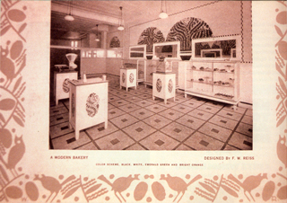
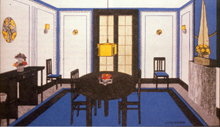
Reiss's first architectural commission, the Busy Lady
Bakery of 1915 (described in 1939 as the first modern
store in New York) is covered at length. The artist
was involved in every aspect of the store's design.
He designed its interior and exterior architecture,
as well as its advertising and bold blue and white packaging.
|
Wentz's M.A.C. and Baumgarten's Crillon
commissions were key factors in the first decade of Reiss's
design career in America, paving the way for increasing success
during the 1920s, out of which he emerged as a well-known
figure in American interior decoration and textile and furniture
design. It was a decade framed by design commissions for two
important hotels, the Alamac and the St. George.
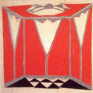
Harry Latz, the developer of the Hotel Alamac,
gave Reiss considerable artistic and financial freedom in
its decorating scheme, to notable effect.
The public rooms of the building were conceived in two very
different styles. In her 1925 article for the International
Studio, the critic Margaret Breuning wrote: "One
realizes the emphasis of decoration in modern murals in the
work of Winold Reiss, who has done a number of restaurants
and most recently the Alamac Hotel. The Hotel Alamac has many
motifs in its decorations varying with the intended use of
the rooms as well as their shape and size. The mediaeval room
is one of the most effective. Its panels represent picturesque
figures of the Middle Ages. The huntsman, the lady fair and
the valiant knight alternating with rich metal panels elaborately
carved. The Congo Room, also known as Congo Roof or Congo
Grille, makes use of the motifs of primitive African sculpture
and ornament, not only in its murals but also in its furnishings
down to the most trivial detail. The effect is remarkably
impressive."
Writing almost a decade later about the use of decorative
metalwork in Rockefeller Center, Eugene Clute identified Reiss's
work at the Alamac as the first and best of its type: "Perhaps
the first notable example of this kind of metal work was the
series of large decorative wall panels that were designed
by Winold Reiss for the Hotel Alamac, New York City, and installed
in the grill room when that hotel was built, ten years or
more ago. They were executed in a combination of metals worked
in repoussé, including wrought iron, copper, brass,
steel and aluminum. The craftsmanship was executed by Julius
Ormos and Charles Bardosy. The work represented scenes of
the chase, rendered with an admirable sense of decorative
values and a feeling for the technique employed."
The Architect and Building News compared the decorative
metal panels with the work of Edgar Brandt, one of the leading
artists of the period.
 |
The Crillon Restaurant, called the "first modernistic
interior in America," featured flat, starkly delineated
wall surfaces; prismatic hues; and large, simplified
decorations, presaging the "super-graphics"
of our own time. All are evident in one of Reiss's small
design sketches.
|
Far removed in both style and distance from
its medieval grill room was the Alamac's daringly conceived
Congo Roof, which represented Reiss's and New York's first
treatment of a tropical theme. Drawing on his knowledge of
both Cubism and African Art, the commission allowed Reiss
to begin to develop a decorative vocabulary that became a
key part of his own repertoire and has remained a popular
sub-theme of American restaurants and nightclub decoration
to the present day. Its stylistically advanced, Cubist-related
ideas are described in New York 1930: "The Congo
Room was part of a rooftop restaurant known as the South African
Garden that, according to Architecture and Building,
was destined to appeal to those craving 'an unusual and garish
setting for their meals.' Elevators whisked diners to a rooftop
entrance vestibule with grass flooring and a straw-covered
ceiling. Entered through the jaws of a vividly painted mask,
the restaurant itself resembled an African village. The theme
was carried out in the chairs and tables and the murals of
leopards, chimpanzees, and snakes. Diners seeking privacy
could take their meals seated at booths made to resemble thatched
huts, which lined the walls and focused on a native 'council
chamber' from which an orchestra blared its jazz. Each chair
back simulated a tribal mask, and the general lighting emanated
from idol masks suspended from the ceilings."
| |
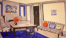
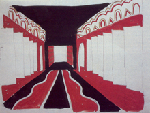
The decoration of the Alamac's rooms,
suites and corridors were also a part of Reiss's commission,
and they allowed him to draw upon the principles of Modern
Decorative Art as they applied to residential interiors.
In a sketch for a sitting room in one of the hotel's suites
(top) we can see its similarities to a domestic interior
(bottom) published in the first issue of the M.A.C. |
| |
|
| |
 |
The decoration of the Alamac's rooms, suites,
and corridors was also a part of Reiss's commission, which
allowed him to draw upon the principles of Modern Decorative
Art as they applied to residential interiors. In a sketch
for a sitting room in one of the hotel's suites we can see
its similarities to a domestic interior published in the first
issue of the M.A.C., part of a feature on the work
of E. H. and G. G. Aschermann, a Viennese team designing American
interiors in the spirit of the Wiener Werkstätten. Mr.
Aschermann was described as having studied with Josef Hoffmann,
and nothing shown belies this. The simple lines of the furniture
are emphasized by their black finish, echoing the strong outlines
of the baseboard, carpet, french doors, and window. Wall panels
bordered in brilliant blue with bright yellow accents complete
the ensemble. Both the Aschermanns' and Reiss's interiors
were unprecedented in American residential architecture of
the period, and would have appeared strikingly modern in the
1930s, as they do, indeed, today. Whereas the Aschermanns'
design was advanced, Reiss's interior was more daring and
original in the studied informality of its furniture arrangement,
the use of brilliantly colored accessories to accent an abstract
painting over the mantel, and simplified graphic elements
punctuating the door and wall planes. All of these potentially
jarring and clearly stimulating elements are harmoniously
combined to create a unified effect. Both designers embody
precisely the characteristics of modern German decoration
observed by French designers between 1908 and 1910 and used
to define and create their own unique and modem style.
Reiss's work in residential interiors during
the 1920s ranged from hotels and apartment buildings to individual
apartments and furniture and fabrics for the domestic market.
Much of it was highly experimental and innovative in character
— including the use of many new materials: in metal,
aluminum and chromium; in fabrics, synthetic products such
as rayon and Du Pont's Fabrikoid and Nemoursa; and paints
and wall coverings like Duco and Muralart, an early type of
Formica. The new types of finishes, effects (including air-brushing),
and colors that these materials allowed were further extended
by the use of new lighting techniques and fixtures. In addition
to working as a color consultant for Du Pont's Fabrikoid and
Muralart product lines, during this period Reiss designed
new products for many companies: fabrics for Mallinson, Schumacher,
Mosse, Martex, and Shelton Looms; furniture for Thonet and
General Fireproofing; lighting fixtures for Egli; and packaging
and advertising for a wide range of clients. His work was
featured in various exhibitions sponsored by New York's leading
department stores as well as the Metropolitan Museum of Art.
In 1928 he joined a number of leading designers in forming
their own design showcase, the American Designers Gallery,
whose first exhibition was organized by Ely Jacques Kahn and
Joseph Urban. Reiss, Paul Frankl, and Donald Deskey were credited
with presenting the designs most likely to make "a practical
contribution to an evolving Modernism."
A few examples illustrate a less practical
but equally sophisticated aspect of Reiss's work in these
areas, the distinctive brand of "zig-zag" modernism
that he evolved during the 1920s, drawing inspiration from
native American motifs.
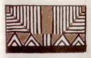
Although a boyhood fascination with native Americans drew
him to this country, the artist's first western trip, including
Montana, Colorado, New Mexico, and Mexico, did not take place
until 1920, followed by a second and longer stay in Montana
in 1927.
Reiss's academic training in the use of pattern and color
made him highly receptive to native American motifs, which
increasingly found their way into his graphic and commercial
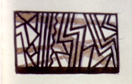
design work. The use of either a zig-zag line (chevron) or
row of linked triangles, commonly used in the art of the Blackfoot
and Sioux nations, became a signature of Reiss's work from
the late 1920s onward.
American, European, and modern sources all come together in
the jagged composition of angles and bright colors that characterized
his 1928 design for the elevator cab of the Seelig and Finkelstein's
Shellball Apartments.
Although its interior no doubt rendered vertical travel more
stimulating than most residents of the building ever desired,
the design would have made any one of Prague's Cubist architects
proud. Sketches of metalwork designs, also related to the
Shellball Apartments, demonstrate Reiss's continuing experiments
in the decorative uses of metalwork and the effects of combining
different metals in a single composition. His eager quest
to introduce lively colors and imaginative ideas into American
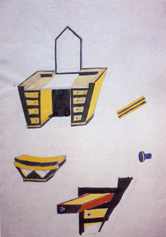
furniture design is represented by a sketch for a dressing-table
and bench of complex angles and contrasting shades of bright
yellow, red, blue, and black, which echo the vocabulary of
the De Stijl movement and challenge any preconceptions concerning
their form.
| |
 |
| |
His eager quest to introduce lively
colors and imaginative ideas into American furniture
design is represented by a sketch for a dressing-table
and bench of complex angles and contrasting shades of
bright yellow, red, blue, and black.
|
The 1920s also marked Reiss's first commissions
outside of the New York area, significantly in the great midwestern
metropolis of Chicago. Holabird and Root, one of that city's
most progressive architectural firms, was linked to three
of these, beginning with murals for the Apollo Theatre (1922-23)
and ending with the Walden Bookshop in the Michigan Square
Building (1930). Reiss's 1928 interiors for one of Chicago's
leading clubs, the Tavern, which occupied the twenty-fifth
floor of a Holabird and Root skyscraper at 333 N. Michigan
Avenue, were widely praised and publicized, winning him a
whole new list of admirers and clients from many parts of
the country.A contemporary article in The Chicagoan described
his achievement in glowing terms: "Winold Reiss, a leader
in the profession of interior decoration, was given the commission.
He was also given carte blanche, with John Root, of
the building committee, exercising the power of veto over
the designs as they were submitted. The result speaks for
itself. The rooms of The Tavern are the most brilliant example
of modern decorative style in the country. There is gayety
and originality, without eccentric affectation, in every detail.
The Tavern, in its physical aspect, is a work of art. And
being modern art, it has a dynamic quality; it refreshes and
stimulates. The visitor to this Tavern drops down to the street
and to everyday life, a better workman, at whatever craft
he practices, than he was before, because the colors and forms
of these rooms have put a new beat into his pulse and a new
vibrancy into his nerves.
In 1930 Reiss completed extensive designs for
the vast interiors of Brooklyn's Hotel St. George, which,
with the addition of a thirty-one-story tower by architect
Emery Roth, became the nation's second largest. As many as
3,500 guests could occupy its 2,632 rooms, and its many dining
facilities were capable of serving up to 9,000 patrons at
any one time. Winold Reiss Studios conceived and designed
most of the public spaces in the new Tower Building, which
"included the largest indoor swimming pool in the metropolis
and the most expensive one ever built; the largest and most
costly banquet facilities in the world, embracing sixteen
magnificent rooms; the largest hotel ballroom in the world."
The architect and historian Robert A. M. Stern has sung the
praises of its ballroom, designed to hold over 3,000 people,
in the prose style of Tom Wolfe: "the single most startling
interior public space of the time in New York ... as completed,
with its myriad colored lights articulating every facet, the
ballroom was a brilliant tour-de-force, a real life version
of movie-modern, a last blaring wail of jazz-age stylishness
at its very best.
His old friend Oscar Wentz described Reiss's stylish treatment
of the entrance to the ballroom: "Leading to this room
is a huge foyer, the feeling of space in a measure imparted
by the 'scaping' (Reiss's terminology for his use of an abstract
decorative motif on floors, walls and ceilings) of the carpet
in three tones of red with diagonal lines suggesting broad
vistas. This same treatment is reflected in the cream ceiling
with bands of red and gold. Indirect light is softly diffused
from the ceiling and columns, casting its warm glow on the
gold and vermilion Muralart walls ornamented at intervals
with metal grill work.
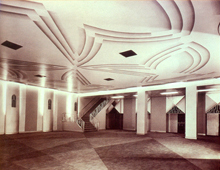
The St. George constituted a city within a city, a great public
arena rivaled only by Cincinnati's Union Terminal among Reiss's
works.
| |
 |
| |
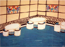
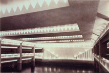
Winold Reiss Studios conceived and
designed most of the public spaces in the new Tower Building
including the largest ballroom in the world which was
designed to hold over 3,000 people. |
| |
 |
| |
Otto Wentz described Reiss's stylish
treatment of the entrance to the ballroom: "Leading
to this room is a huge foyer, the feeling of space in
a measure imparted by the 'scaping' of the carpet in three
tones of red with diagonal lines suggesting broad vistas." |
The great building boom of the 1920s, which
had provided Reiss with so many design opportunities and commissions,
came to an abrupt halt with the onset of the Depression. During
the 1930s Reiss's work was more restricted in range and harder
to find. Among his papers is a portfolio containing dozens
of elegant designs proposed to the Barricini candy company,
which Tjark Reiss says represent his father's attempts to
obtain commissions during this period. His prospects improved
following the repeal of Prohibition in December, 1933,
and a series of commissions from Henry Lustig for his Longchamps
restaurants provided Reiss's career with renewed stimulus
and visibility after 1935.
In addition to their famous culinary offerings,
the second generation of Longchamps restaurants enjoyed some
of New York's best locations and represented the height of
stylishness: "Longchamps is not naive; its is daring
and sumptuous," declared the critic Talbot Hamlin in
1939.
Lavish features introduced by the Longchamps chain included
the extensive use of mirrored wall surfaces and indirect lighting,
complex floor and ceiling levels, table telephone and twenty-four-hour
service, and receding plate glass windows that turned the
restaurants into outdoor cafes in good weather. The first
(1935) occupied the ground-floor corner of the Chanin Building
diagonally across from the Chrysler Building, with lobby entrances
from both 42nd Street and Lexington Avenue, while the largest
and most successful (1938) was ingeniously arranged on five
levels of that icon of American architecture, the Empire State
Building.
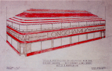
The exterior of Reiss's 1941 design proposal
for a new bar and roof garden at the 49th Street and Madison
Avenue Longchamps displays the chain's trademark vermillion
coloring and lettering, including the falling "S,"
while the undulating lines that enliven its canopy and bronze
wall panels recall the early borders of the M.A.C. The
entire effect is not dissimilar to that of the Barricini candy
box already illustrated: the name or sign identifying the
product or establishment has been completely integrated into
its design; the façade has become a sign rather than
simply providing a place for one.
The care given to the smallest details in the
Longchamps projects, as well as a willingness to experiment
with the decorative possibilities of new materials, is demonstrated
in a design sketch for the inlaid formica top of a bar table.
A Longchamps lobby card of the period is a brilliant exercise
in graphic design,
exhibiting the same qualities. It announces "Cocktail
Time" in a colorful and inviting display with lettering
punctuated by the same motif of linked triangles that Reiss
had used to architectural effect in the ballroom of the Hotel
St. George. The bold treatment of the interiors of the Longchamps
can be observed in a 1946 sketch for the new retail shops
of the 57th Street branch.
Reiss visibly moves the patron through a gauntlet of shop
windows by means of an undulating floor pattern and rhythmic
frieze in which he returns to his roots for inspiration, employing
motifs almost identical to those introduced a half-century
earlier by Kolomon Moser, the great Viennese Secession designer,
in his own house.
The success of Lustig's and Reiss's collaboration has been
summed up in this way: "The Longchamps restaurants brought
to a middle-class audience the glittery glamor of such highly
exclusive haunts of New York's cafe society as the Stork Club
and El Morocco ... [and] represented the culmination of a
decade's search for an opulent and even playful modern language
of form."
| |
 |
| |
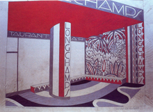
The exterior of Reiss's 1941 proposal
for a new bar and roof garden at the 49th Street and
Madison Avenue Longchamps displays the chain's trademark
vermillion coloring and lettering, including the falling
'S', while the undulating lines which enliven its canopy
and bronze wall panels recall the early borders of the
M.A.C.
|
Following Lustig's sale of the restaurants in
1946, commissions followed for three more Longchamps, completed
between 1950 and 1952. The first, in New York's Manhattan
House, employed Reiss's lifelong mastery of tropical themes
to good effect; another, in Washington, D.C., featured native
American murals and decorations; and the last and least, in
Philadelphia, was carried out in a watered-down Colonial style
that clearly indicates a reduction in Reiss's activity following
a stroke in 1951. Taken as a whole, the Longchamps commissions
played a critical role for Reiss, providing him with new design
opportunities and placing his work squarely in the public
eye. During the last two decades of his career, the Longchamps
work led to many other new commissions, large and small, for
the "stylings" of restaurants, hotels, and commercial
establishments in many parts of the country.
By the mid-1940s at least six Reiss-designed
establishments, including the Steuben Tavern, the famous Lindy's
Restaurant, and four of the nine Longchamps, were within walking
distance from Times Square and New York's Theater district.
The average Longchamps was capable of serving some 800 patrons
at a time, while one employed fifty bartenders. Beginning
with the Crillon of 1919-20, for three decades anyone dining
well in the world's greatest metropolis, including thousands
of visitors, would have been familiar with, if not aware of,
Reiss's designs. This was also true to a lesser degree in
Chicago, with Reiss interiors at the Tavern Club, the Palmer
House, and the Sherman Hotel; in Los Angeles, at Mike Lyman's;
and at restaurants in cities such as Holyoke, Massachusetts,
and Allentown, Pennsylvania.
 |
|
|
A willingness to experiment with the
decorative possibilities of new materials, is demonstrated
in a design sketch for the inlaid formica top of a bar
table.
|
|
In 1949 Reiss received a commission for Montreal's
Chic-N-Coop Restaurant, conceived, in spite of its name, very
much in the elegant spirit of his Longchamps works.
At the age of sixty-four he proved himself to be as creative
and imaginative as ever, producing stacks of sketches and
drawings in many variant schemes for its exterior, interiors,
and graphic identity.
This brief overview is not the place to attempt
any final evaluation of of Reiss's contributions to American
design but has tried to bring some of them to more general
attention. His introduction of entirely new uses and types
of color; experimentation with new forms and materials; incorporation
of poster-like graphic elements; and integration of native
American decorative motifs represent some of the most promising
areas for further study and analysis. It is appropriate to
close with a recent statement by the architect Morris Lapidus,
whose own work is currently the object of renewed appreciation.
His credentials include the practice of architecture in New
York City from 1927 until the early 1960s, providing him a
thirty-year perspective of developments in American design.
Earlier this year, following his return from a lecture at
Yale's School of Architecture, I asked Lapidus if he remembered
Reiss's work and if it had had any effect on his own.
Without hesitation, he admitted instances of his influence
and recalled that, as the preceding pages have attempted to
show, "Reiss was way ahead of all of us."
| |
|
| The bold treatment of the interiors
of the Longchamps can be observed in a 1946 sketch for
the new retail shops of the 57th Street branch. |
| |
| |
|
| |
Between 1950 and 1952 Reiss designed
three more Longchamps, the first in New York's Manhattan
House.
|
| |
|
| |
 |
|
The Manhattan House design employed
Reiss's life-long mastery of tropical themes.
|
| |
| |
| |
 |
| |
At the age of sixty-four he proved
himself to be as creative and imaginative as ever, producing
stacks of sketches and drawings in many variant schemes
for the exterior, graphic identity, and interiors of Chic-N-Coop
in Montreal. |
| |
|
Endnotes
Winold
Reiss came to be much better known for his work as a portraitist
and muralist. This has been partly responsible for obscuring
his reputation as a commercial artist, to which this analysis
attempts to provide a brief introduction. The stigma that
continued to attach itself to commercial art work in this
country often threatened and sometimes compromised the artist's
noncommercial career. Reiss's work as a painter and muralist,
together with the training and theory of artistic practice
that supported it, should not be viewed as a separate but
rather as an integral aspect of his work in architecture and
design. A superb education in one of Europe's most progressive
artistic centers instilled in the young artist a firm and
life-long belief in the unity and equality of the arts of
design, and made of him a stalwart soldier in the battle to
bring the talents of artists to the service of a wider range
of design problems. The Winold Reiss who disembarked from
the S.S. Imperator carried with him to America a willingness
to devote as much energy and ability to the design of posters,
magazine covers, advertisements, fabrics, floor coverings,
wallpaper, textiles, furniture, and interiors as to easel
paintings or mural decorations. His work in these areas ultimately
may prove to have been more influential than his more traditional
artistic endeavors. Tjark and Renate Reiss have been unfailing
in their hospitality, encouragement, and support in regard
to my interest in Reiss's design career and have been very
generous in helping to establish a representative collection
of his work in the Prints and Photographs Division of the
Library of Congress. Tjark Reiss, in particular, shares my
opinion that his father's contributions in this area have
yet to be suitably recognized. This effort may serve, in some
small measure, to correct this situation. While periodic access
to Reiss's archives since 1987 has allowed me certain insights
into his career as a designer, this can only supplement the
years of careful and painstaking documentary investigations
represented in Fred Brauen, "Winold Reiss (1886-1953):
Color and Design in the New American Art," (New York,
1980), an indispensable tool for anyone attempting a study
of this subject. Back.
The
cause of Modern Decorative Art is cited repeatedly
in the manifestos published by Reiss and Wentz in the M.A.C.
and elsewhere during the next two decades. See "A Word
About Modern Decorative Art," M.A.C., vol. 1,
no. I (September 1915): At no time has Decorative Art been
so much the subject of discussion as at the present. There
are two reasons for this. First, by the revival in Europe,
especially in the German-speaking countries, of decorative
art, i.e., of Art in its applied forms. Second, by the misinterpretation
of the words "Decorative Art" as used in the modem
sense of the word and the misunderstandings arising therefrom
.... Modern artists wittingly or unwittingly have changed
the meaning of the words "Decorative Art." In their
meaning of Decorative Art they seek to express in a form,
or series of forms, a certain feeling—this feeling they
call "decorative". The feeling expresses itself
through strong lines and broad colors. Sometimes the colors
are very bold, even crude and hard in combination. Sometimes
they are soft and harmonious, but always the same quality
runs through all; the general effect is big, broad, and simple.
The bigger and simpler the effect, the more decorative the
work. Back.
See
Robert E. Irwin, "Posters and Motion Pictures,"
Modern Art Collector (M.A.C.), vol. 1, no. 2 (October
1915). Irwin was an executive in the Poster Division of Metro
Pictures Corporation. Back.
The
New Tork Times Magazine, March 10, 1929, p. 14. Back.
Tjark and Renate Reiss possess a copy
of this rare amateur publication, whose cover, borders, and
illustrations were designed by Winold Reiss in a manner inspired
more by the Jugendstil and the work of Charles Rennie Mackintosh
than the later Munich School. Reiss also contributed a number
of poems to Jungvolk which demonstrate his romantic
sensibilities. Back.
Friedrich Achleitner, Österreichische Architektur
im 20. Jahrhundert, Ein Führer in drei Bänden,
vol. 3, pt. I (Vienna: Museum für Moderne Kunst, 1990):
93-94, illustrates comparable distinctive undulating bands
employed by the architect Otto Wagner to decorate the exterior
of Vienna's Leopoldstadt railway station, ca. 1904-1908, showing
the motif as a part of the contemporary design vocabulary.
Reiss never visited Vienna, but he employed this motif to
decorate the interiors and exteriors of many of his own buildings,
sometimes in mosaic, as in the façade of the Restaurant
Longchamps at 59th and Madison Avenue of 1939. Back.
This was perhaps adopted either from the work of his colleague
Ilonka Karasz or from Frank Nuderscher, who both employed
the motif in early issues of the M.A.C. Back.
Ulrich Thieme and Felix Becker, eds., Allgemeines Lexikon
der Bildenden Künstler von der Antike bis zur Gegenwart,
vol. 9 (Leipzig, 1978), pp. 280-281. Known not only for
his posters, Diez provided illustrations for the famous publication
Jugend and designed book covers, bookplates, and advertising
art, as well as mural decorations and mosaics for the new
buildings of the University of Munich, the Wiesbaden Kurhaus,
the Nürnberg train station, and other public buildings.
Back.
"A Word About Modern Decorative Art," M.A.C.,
vol. 1, no. I (September 1915), offers the following description,
referring to examples which the publication intends to illustrate:
"Whether a subject is treated with the large expanses
of flat color technique, generally known as the German Poster
style, or with much detailed work, matters not. What matters,
is the broad and simple feeling which finds its expression
in the general effect. If there are many details, they must
be subordinated to the effect in such a way that they do not
weaken or disturb it." In a subsequent article in the
same issue, "Modern Decorative Art for the Advertiser,"
by Raymond Cavanaugh, the author insists that "the claims
of Modern Decorative Art for commercial recognition must be
given the fullest consideration," exhorting the reader
with the confidence of the newly converted: "Let him
[the advertiser] turn to a poster of today, executed in the
true spirit of Modern Decorative Art, and he will find positive
virtues only. There are no negative qualities in Modem Decorative
Art. To put it slangily, it has the 'punch'. Its color is
a joy. Its composition is impressive; its general impression
one of strength, force and character."
Back.
L. 0. Duncan, "The Belle of Yesterday," The Store
of Greater New York (August 1939): "Her lines are
no longer modish, although when she was opened to public view
in 1915, she was the first modern store in America. A great
howl went up from the designers of that period. They sneered
and said that she was too extreme, almost decadent. Sneerers
told architect Winold Reiss to take her back to Paris."
Back.
R. R. Palmer and Joel Colton, A History of the Modern World
(New York 1965), p. 686.
Back.
Brauen "Winold Reiss," p. 17, reports that Otto
Baumgarten reached New York in 1908, after working in Paris
and London, rising through the ranks to become commis at the
Plaza before opening the Restaurant Voisin in 1913.
Back.
Brauen, "Winold Reiss," pp. 18, 21, 25-26, has painstakingly
traced many of these references. See also Robert A. M. Stern,
Gregory Gilmartin, and Thomas Mellins, New York 1930: Architecture
and Urbanism betweeen the Two World Wars (New York, 1987),
pp. 283-84: In 1920 Reiss had pioneered a less scenographic
restaurant design in New York at the Crillon Restaurant at
15 East Forty-eighth Street, which he decorated in what Edwin
Avery Park described seven years later as a "decidedly
modern and thoroughly American taste, using flat surfaces,
broad and colorful painted decoration, based on the patterns
found in Navajo blankets and Indian pottery."
Back.
Brauen,
"Winold Reiss," p. 25, cites both Beverly Smith
in the American Magazine 113 (January 1932), pp. 26-27,
describing the initial Crillon as "the first really modernistic
interior in America, which made a great stir and won him [Reiss]
other important commissions," and Margaret Breuning,
"Tendencies in mural decorations," International
Studio 82 (December 1925), p. 177-178: "About six years
ago Mr. Reiss decorated the Crillon Restaurant and created
quite a flutter in the dovecots by his colorful work. Among
other features of this building was a room treated in modernistic
style and prismatic hues."Back.
Brauen, "Winold Reiss," p. 83, n. 40.
Back.
"Let the Motif be Modern, Advises Expert,"
An Interview with Winold Reiss, The Restaurant Man
(April, 1931), 14: "When Mr. Reiss is called in to design
a restaurant, he usually also designs the furniture and even
the menu cards and meal check, for he believes that all of
these combinations are instrumental in expressing the character
of the establishment." Back.
"Let the Motif be Modern, Advises Expert,"
An Interview with Winold Reiss, The Restaurant Man
(April 1931), 15: "The Crillon's owner, Mr. Baumgartner
[sic], incidentally, is a partner of Mr. Reiss in the restaurant
decorating division of the latter's studios. An unusually
effective combination they make—Mr. Reiss the artist
and decorator and Mr. Baumgartner being a successful restauranteur."
"Winold Reiss Co. Doing Decorations for Alamac,"
The Restauranteur (August 11, 1923), p. 8, stated that
the upper Broadway building, nearing completion, was decorated
by "the Winold Reiss Decorating Company, of which Otto
J. Baumgarten, the noted restauranteur, is the business manager."
Baumgarten was identified as a partner as well as business
manager of the Reiss firm, and as the "proprietor of
the famous Crillon Restaurant ... one of the most beautiful
examples of decorating to be found anywhere .... When it is
taken into consideration that Mr. Baumgarten is an experienced
hotel and restaurant man who thoroughly understands this business,
his position as general business manager for the Winold Reiss
Decorating Company makes this company especially fitted to
handle satisfactorily all hotel and restaurant work."
Back.
"Winold Reiss Co. Doing Decorations for Alamac,"
The Restauranteur (August 11, 1923), p. 8, identified
Latz as a developer who "has made up his mind at the
start that he would spare no expense in making the new Alamac
the very finest possible, and he has shown his excellent taste
by selecting Mr. Reiss for this important commission."
Back.
Margaret Breuning, "Tendencies in mural decorations,"
International Studio 82 (December 1925), pp. 177-178.
Back.
Eugene Clute, "Today's Craftsmanship in Combining Metals,"
Architecture (October 1934), pp. 203-205.
Back.
"A Modern Decorator
in New York," Architect and Building News (November
26, 1926), p. 634. Back.
Stern,
New York 1930, p.283. Back.
Yvonne Brunhammer and Suzanne Tise, The Decorative Arts
in France: La Société des artistes décorateurs,
1900-1942 (New York, 1990): 26: "A dramatic change
in the style of the works exhibited in the salons of the Société
came about as the result of a second manifestation of the
Munich Werkstätten—their appearance in Paris at
the Salon d'Automne in 1910. Since 1900 the growing artistic
and commercial success of the Werkstätten had been a
cause for alarm in France. There was even more concern after
an important applied arts exhibition in Munich in 1908, when
the French delegation, which included one of the founders
of the Société des artistes décorateurs,
Rupert Carabin, returned to report that the German exhibition
represented for France an "artistic and commercial Sedan."
The delegation later reported to a conference on the decorative
arts in Nancy that the long-sought-after modern style had
not been born in France, but in Germany: "The ruling
principle that inspires the young German school is to create
harmonious ensembles through a collaboration of sculpture,
painting and architecture, and the group has endeavoured to
realize this by reforming the aesthetics of the home to make
the modern house a combined work of art, a practical construction
of simple and dignified beauty ... Thanks to the simplicity
which they intentionally seek, they have succeeded in creating
furniture designs of good quality and irreproachable form
that may be executed entirely by machine, so that they are
within the reach of modest budgets. It was after the delegation
returned from Munich in 1908 that Frantz Jourdain ... invited
the Munich Werkstätten to exhibit in Paris in 1910....
When the Salon opened in October, the Munich group... filled
eighteen rooms with the finest products of modern German decorative
artists organized on the theme of the 'House of an Art Lover'...the
interiors were not particularly innovative, but they demonstrated
a sobriety, unity of design and sophistication that completely
surprised the French public. The colour schemes were equally
unexpected: bright oranges, cobalt blue and brilliant greens—hues
virtually unknown in French decoration."
Back.
Stern, New York 1930, p. 338. Back.
"A Modern Decorator in New York," Architect and
Building News (November 26, 1926), pp. 632-34: "For
the inspiration of his decorative motifs, however, Mr. Reiss
has paid a good deal of attention to the work of the American
Indian and Aztec sculpture. Probably as a foreigner he surveys
the field of American inspirational sources with a fresh eye,
and, like one or two other artists, has been astonished at
the richness of Aztec art which can not only be considered
an indigenous but which contain boundless suggestions for
development ... Winold Reiss works in his New York studio
in conjunction with his brother, who is a sculptor, and who
shares enthusiasm for Mexican and Indian work. Both brothers
feel that native art has been neglected in favour of imported
details, and that in Indian work is revealed a sense of pattern
which is in itself an inspiration. Certainly some of the vermillion,
yellow and green interiors of the Crillon restaurants in New
York show a strong Indian suggestion." Back.
"Winold
Reiss - May 1913," typescript biographical sketch, Collection
of Tjark and Renate Reiss. Back.
Stem,
New York 1930, pp. 283-84: In 1920 Reiss had pioneered
a less scenographic restaurant design in New York at the Crillon
Restaurant at 15 East Forty-eighth Street, which he decorated
in what Edwin Avery Park described seven years later as a
"decidedly modern and thoroughly American taste, using
flat surfaces, broad and colorful painted decoration, based
on the patterns found in Navajo blankets and Indian pottery."
The zig-zag or chevron motif first appears commonly throughout
Reiss's designs for the interiors of the Alamac Hotel, insinuating
itself successfully into both his medieval and African themes.
After the middle twenties it occurs increasingly in the distinctive
advertisements for the Restaurant Crillon and later in those
for the Longchamps chain. (fig. 20). Back.
American
Architect (February 5, 1929), p. 173.
Back.
As
late as 1941 his earlier work on the Tavern Club led to a
commission from the architectural firm of Neville & Sharp
to design a new bar and dining room for Kansas City's Hotel
President. One of the architects wrote to Reiss, recalling:
"I remember having seen the murals you did for the Tavern
Club in the 333 Michigan Avenue Building in Chicago, some
years ago..," Neville & Sharp to Reiss, February
13, 1941, Collection of Tjark and Renate Reiss.
Back.
Charles
Collins, "Floreat Taberna! Temple of the Gay Heart and
the Quickened Mind," The Chicagoan (1928), pp.
11ff. Other contemporary accounts included: Athena Robbins,
"A Town Club Decorated in the Modern Style," Good
Furniture Magazine (March 1929), pp. 129ff.; "The
Tavern Club at 333 North Michigan Avenue, Chicago," The
Architectural Record (February 1929), pp. 163-66; "Decorating
the Modern Way," Restaurant Management (July 1929),
pp. 37ff.; The American Architect (January 5, 1929),
p. 36ff.; and "Art Moderne in Chicago's Tavern Club,"
National Hotel Review (April 27, 1929), pp. 62ff.
Back.
Stern, New York 1930, pp. 214-15: The 11,000-square-feet,
thirty-one-feet high ballroom, was reputedly the largest in
the United States, capable of holding more than 3,000 people.
Back.
OW. Wentz, "The St. George Goes Modern: In this largest
hotel of Greater New York are some fine examples of contemporary
decoration," The DuPont Magazine (1930), pp. 14-15.
Back.
Stern,
New York 1930, pp. 283-84: "After Prohibition's
repeal Reiss designed a white, blue, and black cocktail lounge
for the Crillon that was highly regarded by [Lewis] Mumford,
who found it conducive to drinking yet not 'so exciting that
you would get drunk at the first smell of a Martini'. Moreover,
the Crillon demonstrates what the more vital modern architects,
like Wright and Oud, always knew: that architecture designed
for our present style of living does not need to seek its
exponents and admirers among the color blind."
Back.
The
New York city chain grew from six locations in 1935 to at
least ten in 1946. Fred Brauen, "Winold Reiss,"
pp. 48-54, 70, has carefully detailed this evolution.
Back.
The
respected critic and historian Talbot Hamlin drew attention
to Reiss's achievements in the Longchamps restaurants in an
article entitled "Some Restaurants and Recent Shops"
in the widely read architectural periodical Pencil Points
(later Progressive Architecture) 20 (August 1939),
pp. 485-508. Hamlin described the problem of designing a modem
restaurant as a difficult one: "to provide the maximum
seating accommodation within a limited area, and also surround
the patrons with an atmosphere which will make them forget
the small amount of space they occupy and give them the illusion,
if not of privacy, at least of intimacy, in surroundings which
are gay and cheerful ... the idea is to furnish lots of color,
to break up the greater number of surfaces so as to produce
an agreeable sense of complexity, and to use mirrors to create
the illusion of increased size" concluding that the more
recent Longchamps, designed by Reiss, "have attained,
its seems to me, a remarkable success."
Back.
Except
for its beginnings in the M.A.C., it has been beyond
the scope of this analyis to present in any depth Reiss's
work in the area of graphic design. He contributed to a number
of leading American periodicals, including Scribner's
and Fortune, in addition to popular illustrations,
and was a fine printmaker. His most influential work, however,
was in interior design and packaging.
Back.
According
to Tjark Reiss, the Longchamps colors of vermilion, black,
and gold, used here, were the same as those in the silks designed
by Reiss for Henry Lustig's racing stable. Brauen, "Winold
Reiss," p. 48, repeats this. Back.
Vienna
1900, auction catalog, Sotheby's, London (September 23, 1993),
no. 53, ca. 1902. Back.
Stern,
New York 1930, p. 285. Back.
"le
plus chic, le plus luxueux, le plus original lounge de Montréal,"
Le Canada, December 29, 1949. Back.
Telephone
interview, February 1993, prompted by similarities observed
between Reiss's design for the Empire State Building Longchamps
(1938) and the interiors of Miami's Hotel Fontainebleau, designed
by Lapidus. Back.
|